The #1 requirement of your resume is…
Readability
Readability
I have a framework that for a resume to be actionable it needs to be RARe -- Readable, Applicable, and Remarkable.
With the first one being, it needs to be readable.
That was also the top insight for Narendra, whom I coached to land a step-up job that got him a $40,000 salary increase at an exciting company.
“My biggest insight from the coaching was creating a readable resume. Everything changed for me once I knew how the person sitting in front of me reads my resume. Every point showed what difference I had made in that project and my team. This change made me land the correct interviews I was looking for.”
Narendra
Boom.
--
Everyone knows that a hiring manager gives less than 10 seconds to each resume. It may seem outlandish, but I’ve seen it personally with decision-makers. Heck -- I’ve done it myself when hiring for my company.
In that 10 seconds, the hiring manager is NOT trying to judge if a candidate will be their next hire, BUT come to a conclusion, “Huh! This candidate is interesting. I want to know more. Let’s call them for an interview.”
So all of us must design a resume that helps the hiring manager reach that conclusion quickly.
It needs to be scannable. At the risk of being redundant, it needs to be readable.
You may say, “Varun, yes, it makes sense. It’s obvious.”
But, trust me, it takes guts to implement this in reality. It means:
Having white space -- not packing everything about your life in 0.5” margins, less than 1 line spacing, and barely any room for the words to breathe.
Getting rid of the fluff -- the academic projects that don’t match, the superficial summary about how you are a proven team leader, good interpersonal skills, etc., and the lackluster extracurriculars.
Telling an impressive story succinctly and naturally -- and not like a robot talking about having pioneered, sparked, or exceeded something without telling the reader how it impacted your team.
--
So let me show you an example of how Narendra and I implemented these strategies in his resume.

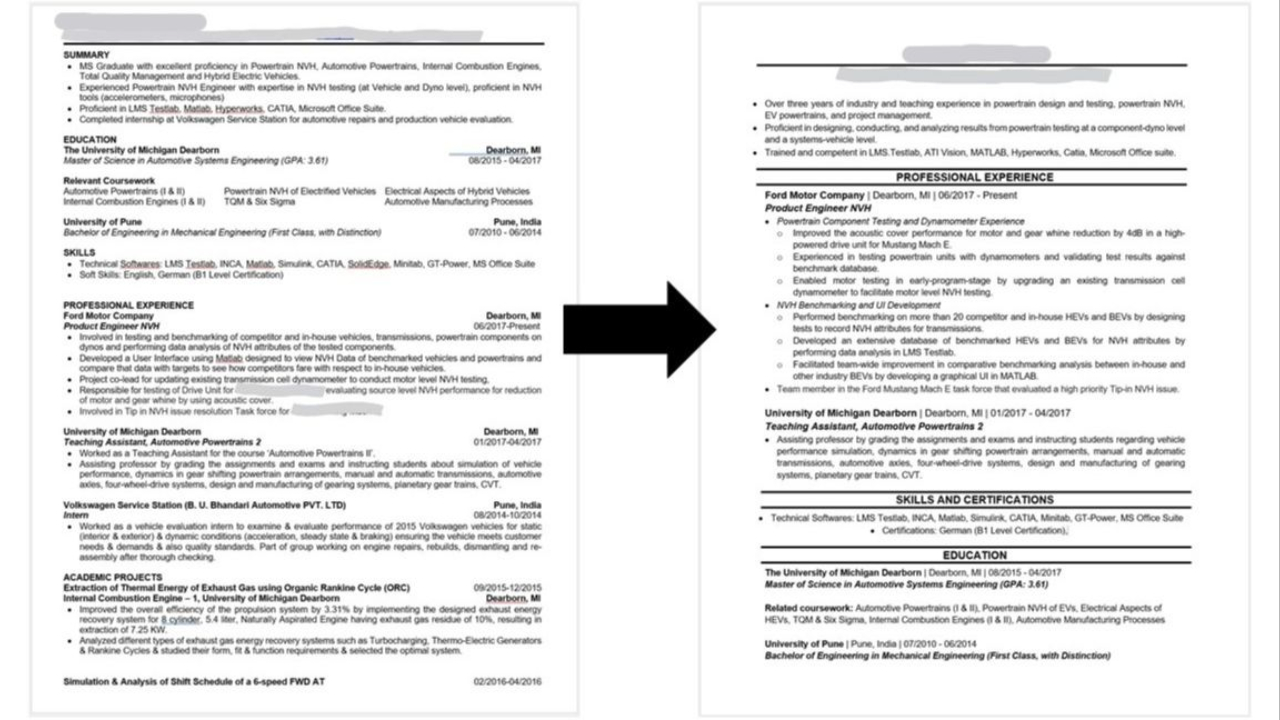
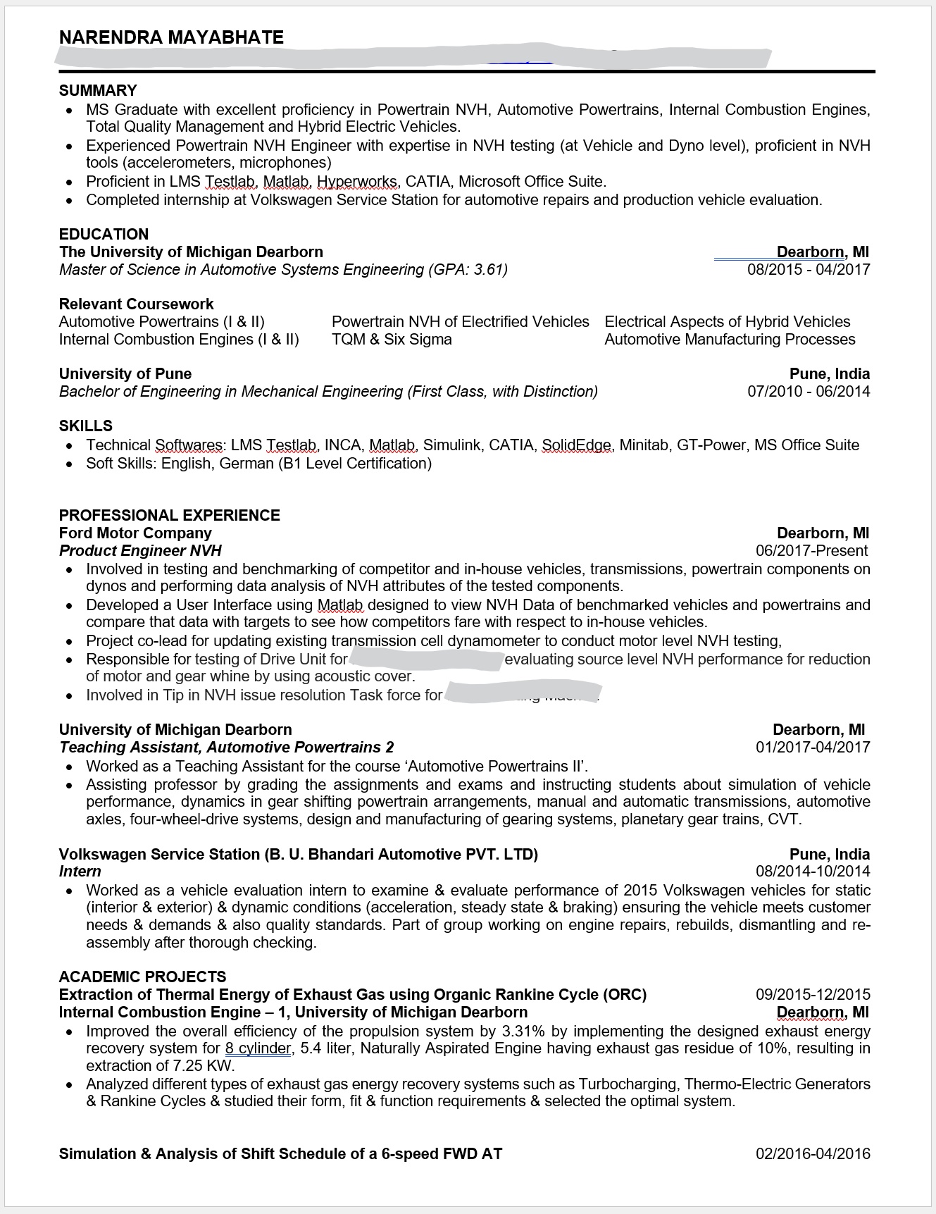
Here’s what the first page of Narendra’s resume looked like before the coaching.
He was interested in positions with automotive companies in the domain of vehicle noise, vibrations, and harshness [NVH], and powertrain/vehicle testing.
Let me take a moment and say that Narendra had skills and experience that were an excellent match for those positions. His resume has keywords that will speak to a hiring manager.
But:
- The resume had so much text that it could be overwhelming
- Bullet points under experience didn’t share the impact of his work
- His strongest point, the work experience at Ford, comes down in the second half of the first page
- The academic project is not applicable and doesn’t earn its place on the first page
- The resume also had a second page with more information
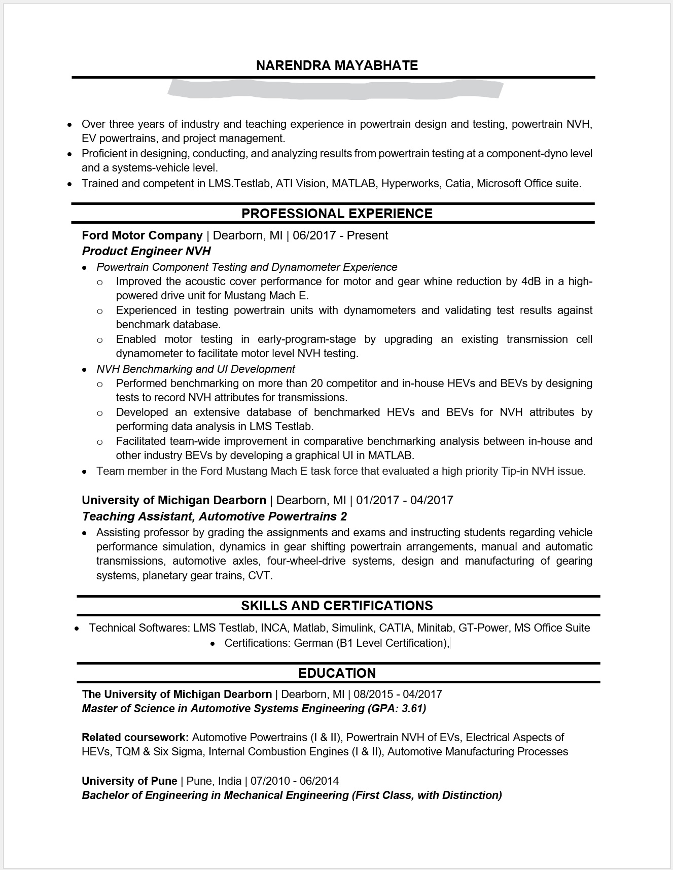
Spend 10 seconds on the resume and see if you can form a clear narrative for Narendra. Yes, there are gems, but it is hard to find them. After working on it together during our coaching sessions, here's how Narendra's resume changed.

You will notice right away that the resume is readable, it doesn’t overwhelm the reader, the bullet points are punchy and meaningful, and he is putting his best foot forward right away.
You might catch other insights, and there are many more nuances that we worked on in our sessions.
Now can you form a narrative in 10 seconds? Hell Yes!
